Groove is a responsive health and fitness web app designed to help health-conscious individuals “Get in the Groove” with their fitness routines.
This is a full end-to-end product design for a health and fitness app where I was responsible for everything from research and wireframing to prototyping, testing, and branding. The prototype provides users with a guided workout experience and allows users to track, record, and analyze their fitness metrics and progress.
Provide users a way to receive customized recommendations, track, record, and analyze health and fitness metrics, while taking environmental factors, knowledge level and physical condition into consideration
Solution
Designed a high fidelity prototype that guides users throughout their fitness journey, grants them access to physical wellbeing features, and provides a platform to record and analyze their fitness metrics and progress on their goals.
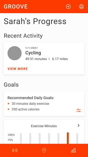
Set Goals, Track Metrics, and View Fitness Progress
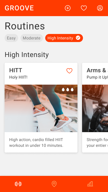
Create and Discover Nearby Routes
Research
User research guided the creation of my user personas, user journeys, user stories, and sitemap.
Methods
4 In-Depth, Contextual User Interviews
2 Surveys, 150+ Respondents
Card Sorting
Competitive Research
Social Listening
Key Insights
Top 5 Motivations:
Health Conscious
Gain Strength
Lose Weight
Aging
Pain/Injury
Top 4 Needs:
Improve overall fitness and health
Exercise without equipment
Expand knowledge on equipment and exercise
Top 8 Features:
Videos,
Progress overview
Personal recs
Non-live instruction
Fitness metrics
Save past workout
Reminders
Awards
Top 8 Features:
Videos,
Progress overview
Personal recs
Non-live instruction
Fitness metrics
Save past workout
Reminders
Awards
Core Personas
These core personas were created based on results from social listening, user interviews, and surveys, and informed key decisions throughout the entire design process.
Meg, 20
Time Constrained Student
“I like animations/videos that show you how to do the exercises”
Goals & Needs
Equipment free workouts
Connect to smart watch
Gain a full understanding of what is required of the exercise and how to do it
Easily and seamlessly follow along to a personalized workout routine
Record metrics for tracking progress and measuring workout effectiveness
Anthony, 29
Data Driven Financial Analyst
“I want to visualize my progress, instructions, and data – the more graphs, rings, maps, the better”
Goals & Needs
Non-guided workouts
Track/record metrics
View progress
Customizable workout & tracking
Tips on form, reps/sets, weight
Ability to avoid injury
Quickly start a workout that tracks his fitness metrics and chosen route
Review a workout summary after completing
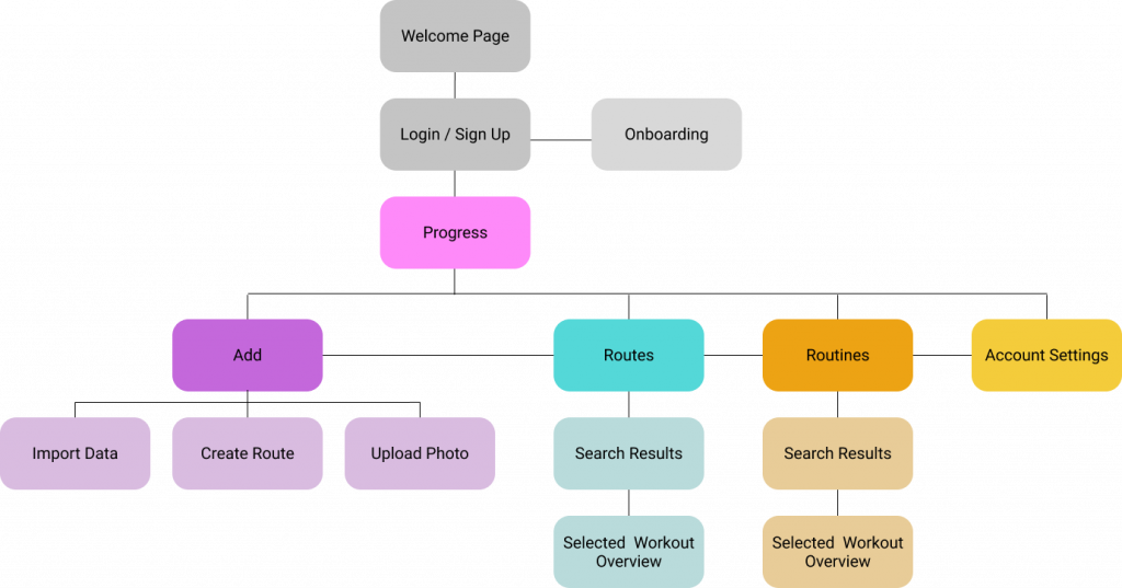
Sitemap
Card sorting revealed clear separation in landing pages for routes, routines, and the “add” drop down menu features. Account settings were also a clear grouping from the card sort, however, results displayed significant overlap with the other features. Those results informed my decision to include account settings as a drop down in the top navigation bar, making them accessible from all landing pages.
Design Process
Groove’s design went through multiple rounds of iterations to incorporate material design standards, grids / responsive frameworks, branding elements, user testing insights, peer review feedback, and accessibiltiy requirements.
Interactions
Groove incorporates many micro interactions including interactive on-page tabs, interactive onboarding buttons, horizontal and vertical scrolling, functional “favorite” and “automatic timer” icons, video controls, and animations.
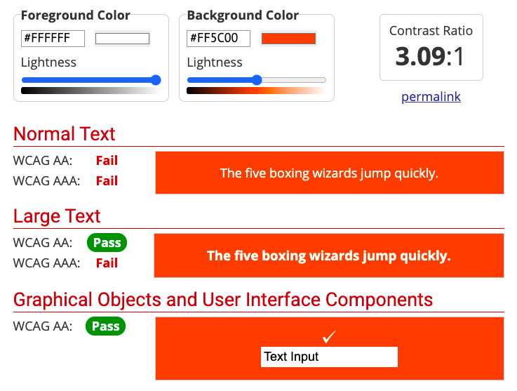
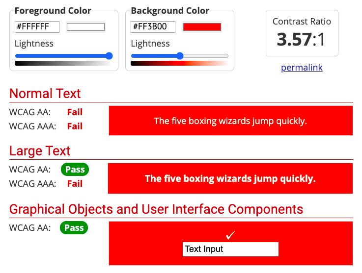
Accessibility
Readability was marginally improved and then validated with user testing. Changes included increased font sizes, bolded text, cropped hero image, shortened subtext messaging to avoid photo subject matter overlap, and a darker orange.
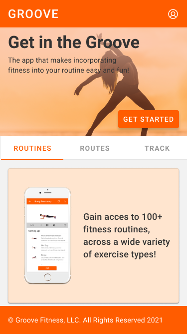
Before
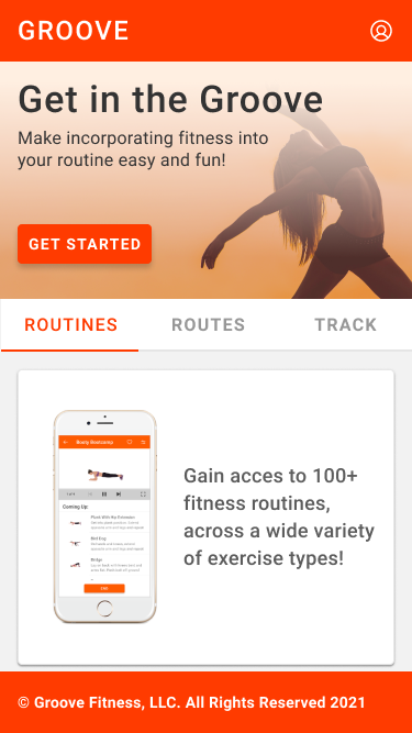
After
Before
After
Branding
Groove’s branding is defined by it’s energizing color palette, casual / ”punny” messaging, delightful animations, and simple / clean design language system, which adheres to Material Design standards.