Groove - UI Design
Groove is a health and fitness app that guides workout routines and tracks progress metrics.
This is a UI Design case study that showcases the Design Language System I created based on Material Design standards. This is a small portion of the broader, full end-to-end product design / UX Design project I created for my UX Design Bootcamp with CareerFoundry.
Category
UI Design
Type
Responsive Web App
Timeline
8 Months
My Roles
End-to-End Product Design
Branding
Design System Architect
Marketing
Tools
Figma
Miro
Optimal Sort
Qualtrics
Pen
Paper
Zoom
Want to hear more about this project? Send me an message at stephaniebippert@hotmail.com
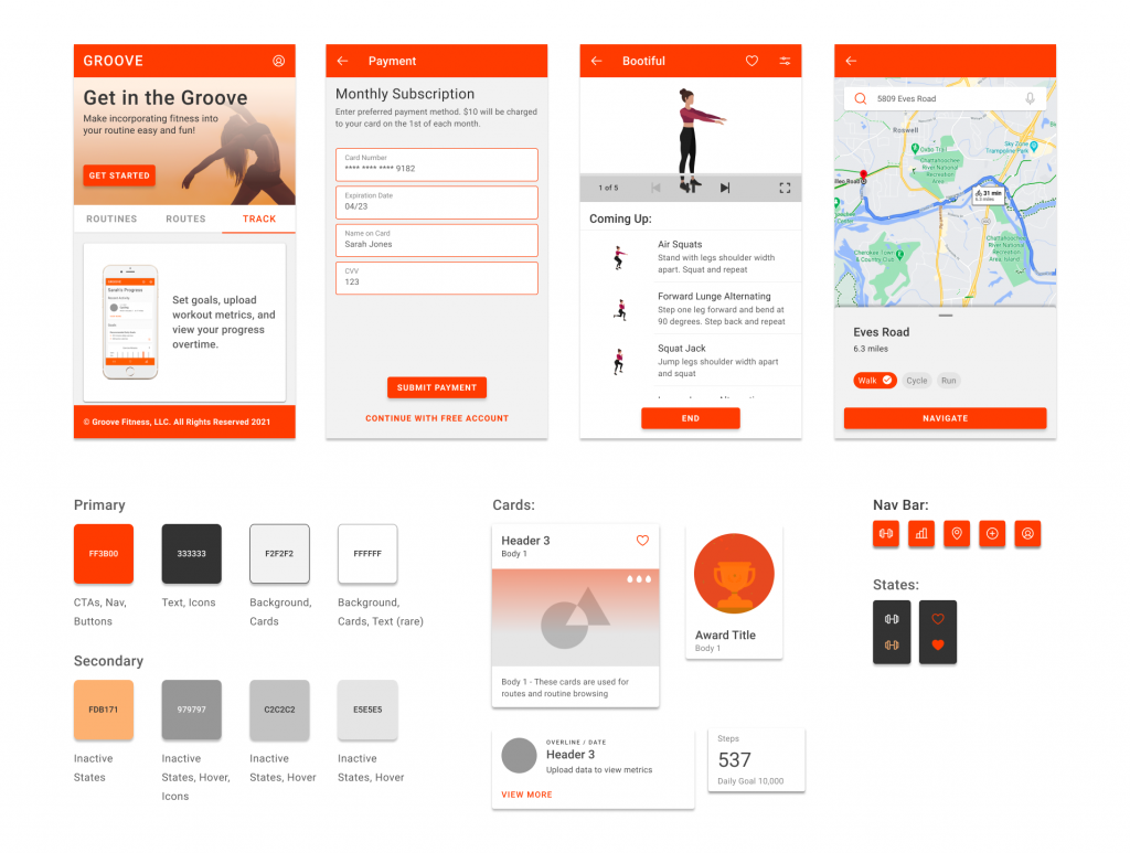
Colors
Color is used to draw attention to key elements and CTAs, as well as to motivate and energize the user.
Color plays a key role for this app and is especially important, as users will primarily be “hands free” while using the app and need to easily and quickly locate key actions during their workouts.
Tone
Groove’s voice is motivating, young, straightforward, and engaging. Helping users “Get in the Groove” with a regular and fun workout routine is the top priority. In order to appeal to the young demographic, I often times used humor and puns to keep the app lively and fun to use.
User Interface
Elements
UI elements such as the navigation bars, buttons, cards, chips, and icons are components I created and reused in order to maintain consistency and simplicity throughout the design.
Disable Auto Timer
Adding Class to Favorites
Start Route Navigation
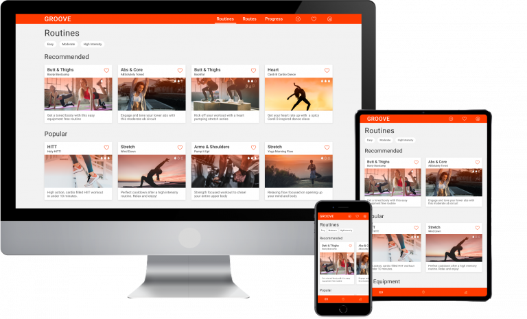
Grids
I created a responsive framework with break points according to screen sizes. As shown below, the design follows a 4 column grid on mobile, an 8 column grid on tablet, and a 12 column grid on desktop.
Scrolling
Scrolling interactions are adjusted according to the device they’re viewed on. All screens utilize vertical scrolling, while horizontal scrolling is only used on mobile and tablet.